
Connecting You to a World of Illustration
cover image by Joseph McDermott
Scrapbook Notebook 6 is available to view and download on Joomag. Originally published in 2012, features in this issue include...
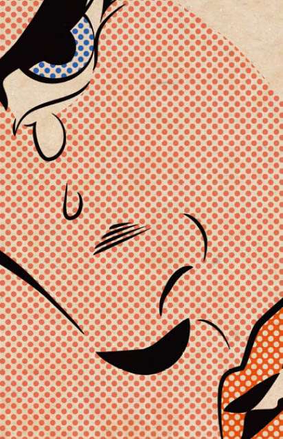
An Audience with Hannah Firmin
Garrick Webster discovers that her image-making techniques might be old fashioned but her book cover illustrations are known and collected around the globe.
book covers for The No.1 Ladies Detective Agency by Hannah Firmin
Don’t worry, this isn’t yet another article about the death of print. But it is a touch ironic that in this digital age one of the world’s best-loved book cover illustrators uses a technique that dates back 500 years. While so many others rely on Photoshop and Illustrator, Hannah Firmin cranks a hand press designed back in the 1830s to produce her wood, vinyl and lino block prints. The authentic, crafted look and feel of her cover illustrations helped Alexander McCall Smith shift well over 10 million books in his the No1 Ladies’ Detective Agency series since 2003. It also helped kick start the handmade trend in graphic design that’s carried on to this day. Her latest piece is the paperback jacket for Wild Hares and Hummingbirds by broadcaster Stephen Moss. “With this one what I ended up doing was very dictated by the title,” she says. “If it’s called Wild Hares and Hummingbirds you’ve got to include something of either of them on the cover!” The overall process wasn’t quite that literal. For a start, she didn’t want the hares to look clichéd. Hares have mythical associations with fertility, and she wanted to avoid this. “I ended up deciding to have two hares boxing, but they made up quite a nice shape, like a badge image on the front. I thought that was quite a bold, eye-catching sort of design, and then it’s got the background going on for more general information about the book.” With those punchy hares in place, what about the hummingbirds? The book is about the natural history of a Somerset village and hummingbirds are extremely rare in the county. That’s where another key tenet of her approach comes in: read the book. “People think, ‘Humming birds, that’s rather exotic.’ But they’re actually referring to hummingbird hawk moths. That’s one point why you have to read the book because you could have gone really wrong there,” she laughs. Even without tropical birds, the final image is rich, rustic and full of life. All the elements were made on the press in her workshop then collaged together into the final composition. It’s how she always works and clients come to Hannah because she has really come to own that particular look. “You stick with a technique because you love it,” she says. “I’m not going to suddenly start changing. Obviously you have to adapt and revive it again with different tricks, but stick with your personal, individual style. Fashions come and go.” The book market, she points out, is changing fast with supermarkets, the major booksellers and Amazon all influencing jacket design. Yet there are so many samey, indistinct covers these days, with vague photos, blurred or silhouetted characters and large text. Perhaps it’s no wonder bookshops are closing. For Hannah, bold and colourful work will always be effective. “I think of it as the packaging for the book so it’s got to be eye-catching.” She’s no longer doing the No1 Ladies’ Detective Agency. It is unusual for a long-running book series to have maintained its original cover look for ten years and perhaps this explains why, despite the huge success of Hannah’s designs, the publishers recently surprised everyone with a new look from a new illustrator. The unfavourable reaction from McCall-Smith’s fans tells its own story however and Hannah’s versions are set to become collectors’ items. Today, when she’s not working on commissions she’s doing personal work in her new studio near that book-lovers mecca, Hay-on-Wye. You can buy a whole selection of prints from her website, including ones made using the blocks originally cut for the No1 illustrations. She also holds several exhibitions each year – the most recent was in August, in Whitstable, Kent. “It comes full circle in the end doesn’t it? The technique that I use is exactly the same as Gutenberg used 500 years ago and my press, which I recently bought, is from 1830. It’s a really old fashioned technique but I’m in work, so I’m not complaining,” she says. “It’s the craft element of it. There’s nothing quite like the hands-on, made-by-a-person look.”
Hannah Firmin's press
Why We Love Vinyl
LPs and their covers create a synaesthetic experience that CDs simply can’t match. Lauren Mortimer spins some vinyl . . .
A selection of classic vinyl album covers predominantly from the 1970s
Since the Original Dixieland ‘Jass’ Band released the first ever jazz record, Livery Stable Blues on 26th February 1917, vinyl has been responsible for bringing the sound of popular music to homes worldwide. And despite the continued threat of other mediums to record and play back sound, vinyl records have not only stood their ground, but in recent times have actually seen the decline in sales heralded in by the introduction of the CD halted and reversed. Time and again the music industry told us that vinyl would not last and would be superseded by more advanced technology. Unfortunately, what the music industry failed to take into account is that people do not necessarily want listening to music to be a pragmatic task. The turning of a 45 single record, the crackle from the speaker, and the large sleeve required to house LPs are all unique charms of vinyl. I started collecting vinyl before I had the means to play them. The ownership of something more akin to memorabilia, rather than the simple means to listen to music, created a buzz that a CD case cannot match. With the purchase of record decks my collection has flourished and the enjoinment of interaction with my favourite songs has increased as the fizz of a second hand record emanates from within. And it seems that I’m not the only one. Vinyl is experiencing a resurgence, one that enthusiasts have been predicting for years. In 2008, 1.88 million vinyl albums were bought, the highest number since Nielsen SoundScan began tracking LP sales in 1991 and nearly double the number reported for the previous twelve months. Previously the majority of sales increases had been seen by independent traders, especially those dealing in second hand wares and those operating at specialist fairs. However, the trend has now translated to the larger retailers and to brand new stock. The history of music is aided by its direct relation to the world of art. With only a few notable exceptions the sleeve as a piece of art work did not materialise until the early sixties, the most notable design before the Beatles being Elvis Presley’s eponymous album of 1956, which was famously to be used as the inspiration for The Clash’s London Calling (1979) cover as well as Tom Wait’s Rain Dogs (1985). In the same way that Pennie Smith captured the raw punk spirit The Clash were trying to encapsulate, the photograph of Presley, off-centre and juxtaposed with the seated DJ Fontana draws the energy of Rock ‘n’ Roll into focus – Elvis unable to be contained. The highlight of The Beatle’s dalliance with album artwork was the Peter Blake designed Sgt. Pepper’s Lonely Hearts Club Band (1967), a cover which cost £2,868 5s/3d to produce, estimated at around 100 times the average cost of an album cover at the time, as well as causing a great deal of problems for EMI in trying to get the permission for the images used in Michael Cooper’s photograph. Over 70 celebrated figures featured, as well as The Beatle’s themselves, not only in their Sgt. Pepper’s guises but also the Madame Tussaud waxworks depicting their famous mop-haired period. Hitler, Ghandi and Jesus were requested by the band, but EMI supposed this would cause too much controversy, whilst the band had to personally write to Mae West to persuade her to be included. Even earlier The Velvet Underground teamed music with cutting edge art when Andy Warhol ‘produced’ their debut album, The Velvet Underground and Nico, stamping his contribution with the renowned banana sleeve design. Initial runs of the album had the banana skin stuck on, when peeled revealing a phallic, fleshed coloured banana. Warhol’s most significant collaboration came with the Rolling Stones for 1971’s Sticky Fingers, the cover featuring a working jeans fly which unzipped to reveal a man’s white cotton pants. Without the large format these album covers would never have come about. Who knows, the resurgence in vinyl could bring about the return of the album of two halves again; meticulously planned to take the listener on a journey, the halfway point necessitated by the two sided format and rendered unattainable by the CD and digital download.